Chart Base Patterns
You'll often see me use terms such as triangle, cup with handle, double top, head and shoulders, etc. Thomas Bulkowski's Encyclopedia of Chart Patterns is by far the best resource on this subject in my opinion. You can also find some very nice descriptions of bases on IBD site or in O'Neal's book. I'll only explain the most basic bullish and bearish chart patterns. To me the overall shape of the pattern is not as important as day to day price and volume characteristics but there are several technicians out there that trade solely off chart patterns.
Bullish Patterns
Cup With Handle
Cup with handle is one of the most widespread and misinterpreted patterns. In general, this is a pattern where price makes a deeper consolidation, manages to rally near highs, consolidates briefly again and then breaks out to new highs.
Now, the biggest problem with cup and handle base is that almost every corrective pattern can be seen as cup with handle if stared at long enough. Of course, we are only interested in the accumulation patterns, that's why I'll try to point out some signs that can confirm or reject cup with handle accumulation base.
First thing we need to pay attention to is the price pattern inside the cup and handle. The best cups form a nice rounded bottom. There should be no big wiggling as this indicates distribution.
Handle should represent a consolidation after a rally from the cup's lows. This means that handle should not drift up (a wedging rally). Rather, the best handles drift down on tight spreads and low volume and don't have any big price drops. Handle should also not be too long and too deep. If stock cannot breakout soon, this would indicate that the handle is actually not an accumulation pattern but a distribution. On the other hand, beware of the handles that are too short. As I said, a handle is a consolidation after rally from cup's lows and if this means let's say 20%, a couple of days of consolidation is certainly not enough for a powerful move into new highs.
The buy point from the cup with handle pattern should be a breakout of the high of the handle, although handle's low can also provide good opportunity for a swing trade. Also, pay attention to how the stock behaves near the high of the cup. There should be no topping signs as this would increase possibility for a double top.
HWD is an example cup with handle formation, though with a bit short handle. It formed a nice rounded bottom, rallied to almost exact highs and then consolidated before breaking out. Now, a swing trader, anticipating a breakout could buy a swing at the low of the handle, though a real breakout happened a week later and 10% higher.


Double Bottom
Double bottoms are also quite commont patterns. Basically, a stock makes two lows. The first one usually represents a selling climax and the second one a test of the lows. Patterns where the second low slightly undercuts the first low are the best, as this effectively shakes out any remaining weak holders and attracts shorts, which will then cover all the way up and fuel the rally.
One important characteristics of well defined double bottom pattern is the look and feel of the rally after first bottom. It should be on decent volume and it should go high enough, so that at the second bottom the stock is heavily oversold already. The second bottom should be on a low volume. High volume indicates supply, which means that lows may be tested later again.
Double bottom could and should make a handle also. The best place for intermediate consolidation is right below the midpoint rally high. Handle should have the same characteristics as cup with handle pattern.
One of the best double bottom patterns I've ever seen was made on BAC after a year long decline. It had all the characteristics described above. Chart is well annotated, so see it for yourself.


Channel
A channel or a flat base is a pattern, where price moves horizontaly for some time, bound with a clearly defined tight range. It is a very constructive pattern during general market corrections which typically produces new leaders of the next leg up. Volume should decrease through the channel and quickly increase when price breaks out above the upper channel line.
There is not much more to say about the channel base. The most important characteristics are tight well defined price range and low volume. Quite often a channel will produce one final shakeout below the channel only to quickly breakout above the upper line. This is an even stronger sign of strength.
A nice example of a channel with shakeout is APL in spring 2011. An extremely low volume during the base forming is clearly seen and shakeout right before breakout successfully fools people into thinking that the stock is breaking down, when in fact it wanted to go up. A test of the breakout area is seen on the chart also.


Flag
A flag is a very short correction after a considerable price run, usually at least 50%. This pattern is most often seen on cheap, thinly traded stocks, breaking out of long term consolidation patterns. The most important characteristics of the flag is its length and volume pattern. Following a bullish rally on high volume, there should be short consolidation, usually no longer than 2 or 3 weeks, on very low volume. Price should stay high or drift just slowly lower, indicating there is very little selling going on. Following this consolidation should be another powerful move to the upside. Flags are best seen on the weekly chart, which should exhibit a very tight low volume structure.
Now, the biggest problem I've faced with flags, especially flags that form a high, tight channel, is that they often produce several failed breakout attempts. In general I avoid buying flags in the first 2 weeks of the consolidation. Another sign that a breakout might be fake is low volume supporting it. Too many failed breakout, especially on high volume, usually ruin the pattern and should be avoided.
VG is a decent example of a cheap stock, rallying about 50% from the long term consolidation area and then forming a flag. Observe the tight range and low volume. There were no false breakouts, which is another good sign. The very first breakout attempt is on increased volume and it closes high. Soon after that BG revards the brave penny stock traders with some easy quick bucks.


Triangle
Triangle is another strong bullish consolidation pattern, which is quite easy to trade, but not very common. Sometimes a stock will consolidate in a range between two lines, one ascending and one descending, which make a triangle. Sometimes one of the lines will be horizontal, which gives us ascending or descending triangle pattern. Triangles often form after an intermediate climax top and are continuation, not reversal patterns in most cases. They can break into any direction and breakouts are usually pretty reliable. As in all accumulation patterns, volume should decrease along the triangle and increase on a breakout.
One thing to be careful about when dealing with triangles are shakeouts. Quite often I've seen triangles breaking down, only to quickly reverse and break to the upside. If you see any of these, they are almost certain winners. Also, don't rush into trading breakouts out of triangle. They will typically produce several failed breakouts into both directions. A really powerful triangle should contract almost to zero point. Both trendlines should be very clear connecting highs and lows. Watch volume clues for a real breakout.
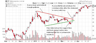
MCP in 2011 is a nice triangle example. It formed a perfect triangle consolidation following a climax top. After several touches of both trendlines, stock finally broke down. However, instead of forming a new downtrend it stalled for a week right below the triangle apex. Those who were patient (and wise) enough to keep MCP on their wathc lists, could buy a strong breakout above descending triangle resistance line and watch a 50% rally following it.

Bearish Patterns
Head And Shoulders
Head and shoulders is probably the most »popular« bearish reversal pattern and, similar to cup and handle, people seem to see head and shoulders' just about everywhere. It is a distribution pattern, where price goes to new high, then collapses, but recovers into new high again. Big money uses this rally into new high to distribute, so rally quickly vanishes and price drops considerably. A swing low is formed, which defines the neckline of the pattern together with the first shoulder swing. After this plunge the price doesn't recover anymore. It makes one or more desperate attempts to breakout, but every rally is depressed by more selling.
As I said, you can find head and shoulders on almost any chart. But, there are some details that can help us define the real head and shoulder patterns. First of all, a well defined head and shoulders pattern should have a descending neckline. If price is able to penetrate previous support and make a lower low, this is a very strong sign that support has dried up indeed.
Second, the head should exhibit topping pattern. This is very important. If there is no clear top in form of a climax top or a rounding top, which is a base for the following plunge, chances are that the second shoulder is just a normal pullback.
Third, price should fall hard from the top. A drop from the left shoulder is not as important. You can ignore it completely. What is important is that after a top is formed, the price should loose ground and slice through previous support.
One final confirmation is behavior after the big plunge from the top. Usually it is very difficult to say anything in particular, but in general, a stock shouldn't form new constructive base. Sometimes there will be only one rally attempt in the right shoulder, but there can be more. Several failed wedging rallies into resistance are the best. A pattern of lower highs should appear and if price makes one final failed breakout on very low volume, this can be a good place to short.
NBR made a head and shoulders topping pattern in 2011. After the left shoulder, price went into new highs, formed a double top topping pattern and fall down to previous support in three weeks. The next rally was unimpressive and a very clear neckline was soon broken, which confirmed the pattern.


Double Top
Another very common topping pattern is double top. This pattern can be devastating if caught into the decline, so pay attention to this section.
In double top pattern price makes new high, usually on very high volume (a climax top), and then drops considerably. A rally attempt into new highs should follow. It can be on any volume, but stay particularly alert if volume is high. Areak into new highs attracts many new buyers who think that the stock still has more upside to go. This is a chance for big money to distribute their shares in another climax manner. After big money is out, previous high should soon be taken to the downside, which completes a double top pattern. A price should then fall quickly on solid volume as those who bought a failed breakout try to sell their shares.
Sometimes technicians also mention triple or even quadruple tops, bit I have not found these to be particularly reliable. In most cases they actually represent an ascending triangle bullish pattern.
Silver and its ETF SLV made a beautiful double top with climax selling in April 2011. After a long uptrend SLV went into a parabolic advance stage, which ALWAYS end with a climax top. One day the price gapped up, started falling, and barely recovered until the end of the day. The volume was the biggest volume in history of the ETF. Price recovered into new highs, but then made a high volume doji candle. Doji is a candlestick pattern, where price closes almost exactly where it opened and often signals a reversal. Of cource, we now know that on this day smart traders sold everything they weren't able to sell at the previous climax. Price collapses soon after that.

Contextual Patterns
Chart base patterns described above are valuable in understanding constructive bullish and bearish consolidation/distribution areas, but my trading strategy is built on basis of six specific contextual patterns. In term contextual I mean that they don't describe any specific chart pattern, but arather a stage, or a cycle, that the stock is currently in. Each of these six bullish patterns has its own specific properties that describe a "story" behind the stock and everyone is treated differently. I'll describe all patterns on examples.
Accumulation Day


Contextual Patterns
Chart base patterns described above are valuable in understanding constructive bullish and bearish consolidation/distribution areas, but my trading strategy is built on basis of six specific contextual patterns. In term contextual I mean that they don't describe any specific chart pattern, but arather a stage, or a cycle, that the stock is currently in. Each of these six bullish patterns has its own specific properties that describe a "story" behind the stock and everyone is treated differently. I'll describe all patterns on examples.
Bounce
The first pattern is called a "Bounce". This is a very short term reversal pattern. Basically what I want to see is a downtrend, followed by some sort of shakeout on increased volume. Traders like to short rallies in downtrend, so after the stock produces a little bit of a bounce from oversold conditions, progress usually stops as bottom fishers start taking profits and new shorters start to pile in. And this creates an opportunity for a short squeeze. If too many traders get short the stock, and it breaks above the line where most stops are placed, stock can explode higher, trigerring stops and causing short covering. If there is some buying pressure behind it, so much better.
Bounce patterns are very difficult to trade. It's hard to get in at the right time and even harder to get out. It's usually the best to just sell when price reaches some overhead resistance. However, when you do catch that sweet spot, a Bounce can produce some very nice gains in a very short ammount of time.

Bottom
I've named the next pattern a Bottom. It is much safer pattern to trade than Bounce, because this is a pattern where a clear buy point is defined, which is often not the case with Bounce. After a stock has been in downtrend for several months, trend will have to be reversed at some point. The first signs of possible short term bottom are several strong up days, which is what I'm looking for. CRME on chart below started bottoming with a huge accumulation day, followed by an ascending triangle. A breakout above that upper triangle bound triggered a huge buying pressure. What is important is that Bottom pattern is a bit longer term basing pattern. It should take at least two to three weeks of consolidation before breakout. And second, because stock is so extended to the downside there is very weak overhead resistance, which makes it much easier for a stock to gain 20% or more in just a few days. On the other hand, stock is still in a downtrend. If weak holders decide to get rid of their positions in short term strength, this pattern can also make you some very quick losses if you don't sell in strength.

Squat
A Squat is a pattern that is some kind of corollary to Bounce and Bottom patterns. If there is some real strength in the stock, it may create a constructive base, usually just below its previous support area. Stock is obviously showing some strength as it wants to stand up (from squat) eventhough there is plenty of overhead resistance above its shoulders. A buy point is break above this line. Again, Squat rellies a little bit on a short squeeze as traders short rallies into resistance. If breakout occurs, price may swiftly jump 10 to 20% in a matter of days. However, due to plenty of overhead resistance from previous distribution area, squats usually don't get very far on a short term basis. Taking quick profits is suggested.

Resurrection
Resurrection is a patterns that is often morphed from Squat. What this basically is is a longer term bottimng accumulation pattern. We could say this is a large Squat. But there is one fundamential difference. A constructive Resurrection pattern has no obvious overhead resistance line. Also it is relying on real buying power, not a short squeeze rally.
Resurrections colud be held for a longer period of time. Because there is no obvious resistance we may set a target on some round number or simply project the depth of consolidation. However, when those 20-30% are made, Resurrections will often start topping out and sthus should not be held for position trades.

Launch
A Launch is beside a Bounce the most speculative pattern of all. The mechanics behind this pattern goes liek this. Everyonce in a while a stock that has been in steady downtrend for several months will suddenly just shoot up from the very bottom. An analogy with a rocket being launched from the launch pad should be obvious.
Now, this first stage is not buyable by any means. It always happens too fast without any signs, making even up to 200% in a few days. But, after that first wave of buyers gets exhausted, stock will often start to prepare for the second stage of the launch. These brief 3 to 5 days long periods of rest are usually enough to ignite second stage launch, which can take the stock up another 20-50%. And this is what I'm up towith this pattern.
Selling Launch is probably the most difficult of all. Usually it is the best to sell something on every strong up day, trailing the rest. But the main thing to remember here is that every later stage tends to be weaker than the previous one. Buying second or third consolidation may not be a good idea as stock is already widely known, heavily shorted and huge profits are just waiting to get taken out.

Breakthru
Breakthru is a classic breakout ot new highs pattern that we all know. Not really much to say here. A stock that is trading at all time (or at least a long time) highs, consolidates from few weeks to few months, draws a clear resistance line, which becomes a buy point, and breaks out.
These are generally the safest buys and can be held for a longer period of time for a long term gain. I don't use any specific targets, but will usually project the depth of consolidation to the upside to get a feel of where I could take some off. A plethora of Breakthru patterns showing on screens is one of the most reliable signs of a new bull market developing. This is logical as breakouts from these patterns tend to produce the most consistent uptrends, which do not end in just a couple of weeks. On the contrary, very few Breakthru's showing up may mean that bull is coming to an end or bear market is at hand.

Runaway
The final pattern in my arsenal is something that I call a Runaway. What this is is simply a stock that is consistently trending up without any obvious consolidation. It usually starts with a breakout out of Breakthru pattern and the best stocks simply don't make additional obvious bases and must be bought on pullbacks.
An example below is STMP in 2011. It all started in July when stock gapped up, starting its fabulous run. Anyone waiting for another base was left behind. The only way to get a hold to this stock was to buy one of the pullbacks down to around MA20 or MA50.
It's impossible to predict when a runaway move will end. Often it depends on the market. If market is cooperational it may end in a spectacular parabolic top. If not, Runaways may just slowly top and reverse their course. In anyway it is a wise strategy to sell into every rally into new highs, but always leaving some in case a stock goes insane. Plenty of runaways are a sign of a healty bull market. Lack of them is a blueprint of bear markets.

Accumulation Day
Accumulation day is a day on which big money has been accumulating, plain and simple. In general, smart money buying should consequently push prices up on volume increase, but this is not necessary. Smart money in fact almost never buys in strength as this means they would push prices up against their own buying. Accumulation can thus be seen on a chart as an up day or a down day, but two point are vitally important:
· Volume should be high. If volume is low this means that big money is not behind the move. If they were, the volume would have been high. However, I tend to be very sceptical when I see an enormously high volume, especially if price doesn't make any substantial move up. Unusally high volume spikes usually mean that someone was selling big, because for every buyer there also has to be a seller. Volume size should thus be taken into context with the overall price and volume action.
· Close should be high. A high close indicates there wasn't any selling into the rally. The best accumulation days happen on gaps down that close very strong on a wide price spread and above the gap line. A hammer candlestick or a narrow spread gap down day (a doji candle) are also frequent accumulation patterns, but I always want to see a confirmation, meaning that price should go up after accumulation, not down.
· As with distribution days, I also check the next day when counting accumulation days. If the the day after accumulation day is a high volume down day, there was obviously some selling in the high volume the previous day, which then cannot be counted as accumulation day.
Distribution Day
Distribution day is a concept I've been introduced to by William O'Neil. In his book How to Make Money in Stocks he describes a distributon day as »a day with a volume higher than the previous day but with no price progress«. This definition is too general to be of any practical use so O'Neal then discusses it further, defines some limits and presents a number of examples. Some other people have then developed a real science around it. A very deep discussion about distribution and follow through days can be found on Virtue of Selfish Investing site. I don't like to be scientific about anything regarding trading, so I'll just briefly explain how I understand a distribution day.
In general a distribution day is a day on which supply swamped demand. This means that on this day there was more selling than buying. This supply swamping demand can reveal in many ways on the chart, but two parameters are crucial:
· A valid distribution day should have high volume. In general it should be higher that the day before, but this is sometimes not enough and sometimes it is also not necessary. It all depends on the context. I will avoid rigid rules, so I'll just say that the volume should be very high. A low volume on a down day could very well mean a test, so be careful when counting distribution days.
· A close should be low. A down day on a volume increase and close off the lows could mean that buyers stepped in at the end of the day, which cannot be understood as a distribution day.
· The next day is also important. If the the day after distribution day is a very strong up day on good volume, there was obviously some buying in the high volume the previous day. So I always look for the next day or two also before proclaiming a distribution day.
Distribution day can also be seen on an up day. A high volume up day on narrow spread or wide spread and low close can be seen as a distribution day. Again, there are many variations of this setup which I'm not going to esplain into details. Check IBDs site or VSA for more information.
I use distribution days mainly to try to define tops in general market and individual stocks. Usually I'm not too concerned with the exact type of the distribution day. As I already said, two things are crucially important, volume and close. Whenever I see high volume in an uptrend I become very causcious as this usually means that top is imminent. I also try to put distribution days into context of rhe general market trend. For example, a distribution day very late in a downtrend could very well represent an accumulation.
So, please don't make a science out of distribution days. You won't be able to find a mathematical formula which will work every time, I assure you. Day to day market monitoring is the best, as usual.
I noted some accumulation and distribution days on Nasdaq Composite chart.

Follow Through Day
Many people tend to mix accumulation day with a follow through day (FTD), defined by William O'Neil. Not every accumulation day is a follow through day. FTD is always seen only after a bottom reversal formation. In general it is an up day with significant price gain on volume increase and it serves as confirmation that the reversal was real not some kind of a fakeout.
It should also be noted that a FTD doesn't necessarily have to appear as a one day bar. Two or three up days on solid volume can also serve as confirmation of the new uptrend. The important thing is that every valid FTD should be accompanied by a large number of stocks breaking out of solid base patterns. An up days on increased volume appear all the time on major indices, but not every such day will have a support of strong stocks breaking out.
Acumulation/Distribution
Accumulation and distribution days can be used on a day to day basis to predict short term moves. On a larger scale, namely weekly charts, an understanding of bigger accumulation or distribution pattern can provide very valuable clues about the longer term market direction.
Before I continue I must point out that it is usually very, very difficult to correctly interprete accumulation or distribution pattern on a chart. Only in very rare cases price and volume action is such that this is easily recognized. I will just provide some usual patterns that may give you some clues, but in most cases such analysis can only be performed in hindsight, with the future price already known. Again, it is very difficult to do it in real time.
Signs Of Accumulation
One sign of accumulation can be seen out of an overall price pattern. Patterns like rounded bottom, double botton or inverse head and shoulders can suggest that the bear trend might be reversing. There are several other known bottoming patterns, but these are the most frequent and the easiset to spot on a chart. The most comprehensive book on chart patterns is probably ThomasBulkowski's Encyclopedia of Chart Patterns, which I highly recommend to anyone serious in trading from chart patterns.
I never trade on the basis of price pattern only. I always look price in the context of volume pattern supporting it. When looking for accumulation at the bottom what I usually like to see is a sudden plunge, sometimes below the supporting trendline, a big volume increase, a rebound and a test on lower volume. Following a test should be a new uptrend if this really was an accumulation. Patterns like double bottom and inverse head and shoulders result from this behavior. BAC is a perfect example of selling climax with a test – a double bottom accumulation pattern.

With a selling climax all accumulation is done in a mather of a couple of days or weeks. When this doesn't happen big money may accumulate over a span of several months. On a chart this can be seen as a relatively low volume rounding cup, followed by a new uptrend. Rounding bottoms by itself are difficult to trade as it is usually almost impossible to find a logical entry point. However, any base following a breakout out of the rounding bottom can provide a good buy opportunity. AAPL formed a rounded bottom accumulation pattern during the forming of 2009 bear market bottom.

Another useful clue, especially inside the rounding bottom pattern, is a number of high volume up days, i.e. accumulation days. These days sometimes create a pattern that looks like a staircase. Each accumulation days pushes the price higher, creating a new higher low. If price deosn't fall considerably below any of the »stairs« we can conclude that someone is accumulating at the precise price levels. VRX provides a staircase example, best seen on a weekly chart.

Signs of Distribution
In most cases we could just reverse accumulation charts upside down and get corresponding distribution charts.
The first one is buying climax. After a long uptrend stocks will sometimes have a parabolic run, usually with several up gaps, accompanied by a massive volume. Big volume always mean big selling and in majority of cases such a parabolic run creates a long term top. Price usually declines very quickly and rarely comes close to highs. If it does, this may create a double top pattern, but real climax tops always end with only one spike. SLV is an example of a double climax top.

Climax tops are easily recognized, but quite rare in the real world. In most cases stocks top with some irregular pattern. Sometimes it can be close to a head and shoulders or rounding top pattern, but usually just a little shift of the viewpoint can create a bullish pattern out of it. The most valuable clue is, as always, volume. If a stock produces several big volume down days, followed by failed rally attempts, this is almost certainly a distribution by major players, regardles of the price pattern.
Also, a basic pattern of lower highs and lower lows usually mean a distribution. On a chart this is seen as a pattern of spikes (can be into new highs or not), quickly followed by a drop. This means that someone is selling every rally in a stock. Spikes and drops should eventually create a pattern of lower highs and lower lows and thus push a stock in the downtrend. AMX topped in 2011 in a pretty irregular manner.

I'll add additional signs of accumulation or distribution if I spot any new patterns. In the meanwhile you can check a pretty good article discussing this subject into details.
For more information about bottoming and topping patterns you can check IBDs site or read a good article The anatomy of a trading range by Jim Forte.


Support (Demand) and Resistance (Supply)
Support on the chart is the price level at which obviously demand came in as price quickly bounced of. If this happens several times in a row, a trend or support line can be drawn. The strongest support levels are the ones that are touched twice at most though. This is because if there is really a demand for the stock at that level, price should quickly take away and not return to the same level two or three more times.
Sometimes a price will advance to some level and then fall down on dramatic increase in volume and cuts through some important price level, where many traders held their stops. Such a move captures many traders in weak long positions. These traders will do anything just to break even, so they will sell into any rally into the previous high volume support area. This area now acts as resistance as there is plenty of overhead supply i.e. traders that are waiting »just to get out«.
GDX is not perfect, but still informative example of how support and resistance lines are drawn on charts. Maybe the most important lesson learned from this chart would be that you should not take these lines as concrete walls. Very often price will break support or resistance just to reverse soon after. Such little breaks successfully shakeout all the technical traders that buy or sell exclusively on the trendline breaks.

Test
A test or a test of supply is a pullback into some important are on the chart. Usually after some big accumulation or a breakout a stock will come back down into the area of high volume to test if there is still any supply present. A successful test should be on low volume and should react quickly to the upside after forming a swing.
When looking for a test we should be very careful to put it into a correct context. A test is considered to be a bullish pattern but it can be easily mistaken for a normal pullback or even for a continuation of the downtrend.
I'm not going to explain all different variations of a test here. A very comprehensive description of tests can be found in Tom Williams' book or on VSA site. A nice example of the test after breakoust is VRUS. I often see people mistakenly think that the most constructive tests are the ones that touch the breakout line. On the contrary, the strongest breakouts I've seen actually rarely came even close to the breakout area. The best stocks will never provide a good second chance to step on board. If you get it, you should become sceptical about this stock.

Climax Top/Bottom
Climax tops or bottoms are pretty rare animals, but they offer the best profit opportunities and can also cause the most damage if you're on the wrong side. A climax top happens when a stock's advance becomes so rapid that a price looks like a parabola. Price simply goes up, often with up gaps, day by day without looking back. These kind of moves tend to attract public as no one wants to miss a »great opportunity«. However, smart money knows that when buying reaches a peak, a price will fall of like a waterfall, usually cutting a stock in half in a matter of weeks or even days. Climax tops are very grateful patterns to sell into, but their main problem is that it is virtually impossible to determine when a real top has been reached. You can basically sell on the way up or wait for a reversal, but in any case, a sell trade in range of 10% below the absolute top should be treated as perfect call. I showed the chart of silver climax top in 2011 in several sections, but you should really stick this pattern into your head, so here it is again.

Climax bottom is a reverse pattern of a climax top. Every once in a while public will freak out as the stock cannot find its ground. The price will fall day by day, again drawing a parabola to the downside. At some price level smart money will decide the stock has fallen enough, so they will just open their wallets and buy every single sell order that comes in. Once the selling has exhausted, a price will skyrocket. The same as with climax tops, any trading around climax bottoms is a pure lottery. Again, a weekly shart of Apple as an example.

Uptrend/Downtrend/No-trend
I talk about trends a lot. Regarding its trend characteristics a stock can only be in one of three modes:
· Uptrend – a stock is making higher highs and higher lows.
· Downtrend – a stock is making lower highs and lower lows.
· No-trend – a stock is making lower highs and higher lows (a contracting triangle pattern) or higher highs and lower lows (an expanding triangle pattern).
Keep in mind that definition of a trend only has sense in specific time frame. For example, on a weekly chart a stock may be in uptrend, but it can also in a downtrend on a daily chart.
All three trending modes are displayed on charts below.


Now, the most important concept in regards to trends are transition between trends. I've developed several rules to help me define when stock is in an uptrend, downtrend or in non-trending mode. Rules are as follows:
A stock can never go from uptrending to downtrending mode and vice versa before being in non-trending mode for some time.
This rule is logical because if stock is making higher lows and higher highs (uptrend) and then it makes a lower high or lower low it is by definition in non-trend. The same applies for transitions from downtrend to uptrend. This rule is displayed on the GLD chart.

When in contracting triangle non-trending mode, a stock goes to uptrending/downtrending mode when it becomes clear that a new high/low will be made.
This rule is logical again as it means that with a break in one or another direction we'll get a higher high/higher low or lower high/lower low pattern, which is a basic definition of an uptrend or downtrend.
An exception to the above rule: when two contracting trendlines along highs and lows can be drawn (at least two lower highs and at least two lower lows) a break above/below descending/ascending trendline puts a stock in uptrending/downtrending mode.
This rules tries to predict the future trend on the basis of a trendline break. So, eventhough a higher high or lower low has not yet been seen, I suspect that a break above or below the trendline is a beginning of a new trend.
Keep in mind that this rule is only valid for contracting triangle patterns. See CXW as an example of this transition.

When in expanding triangle non-trending mode, a stock goes to uptrending/downtrending mode when it becomes clear that a new low/high will be made.
Expanding triangles are quite useless for trading in my opinion. But, to be consistent I have to define these trend changes also. So, this rule simply means that a stock goes from non-trending to trending mode when a swing is made inside expanding triangle pattern and the break out of the expanding triangle is made into any direction. See MOS as example.

Trends are one of the primary tools of my methodology. It should be obvious that I only want to buy stocks in confirmed uptrend, short stocks in confirmed downtrend and not trade stocks in non-trending mode.
Swing High and Swing Low
A swing is basically a change in trend on candle to candle basis on any time frame. I define a swing high as a break below the low of the candle that made a high in a short term uptrend. A swing low is a break above the high of the candle that made a low in a short term downtrend.
Now, obviously swings happen all the time on all charts and time frames. Therefore, they should be taken as a helpful tool, not as exact science. I'm only interested in swings that are made in a specific setup that I'm looking for. For example, I use swings to define trends, support/resistance lines and possible buy/sell points. Usually I also want to see a specific volume pattern around the swing to confirm it. I noted all the swings on the SPY weekly chart below.

Technical Analysis
I often use terms known from technical analysis of stock charts, such as trend line, channel, wedge, support, resistance, etc. I don't feel like explaining all this here as there are plenty of much better resources on the web. If you are not familiar with this terms, you can just google »stock charts technical analysis« or buy a book on this subject, because you won't be able to understand any web page on trading without this knowledge anyway.
Fundamentials
Sometimes I will discuss fundamentials. What I mean by that is financial data of a company. As you might have noticed I don't pay very much attention to fundamential data, but sometimes they can provide some clues when in doubt. Among all the information in the company finacial sheets, there are only I few that I may look at.
Earnings per Share (EPS) Growth
Earnings per share or EPS is the ammount of company's earnings per each outstanding share. I'm not as interested in the actual EPS as I am in the EPS growth. Most companies report EPS data quarterly. If you compare current EPS with the EPS reported in the same quarter last year, you can get a pretty clear idea of how good a company is doing. You can do the same on yearly basis.
Sales Growth
Sales or revenues is income that a company receives from it's normal business operation, like selling goods or services. As in EPS I'm usually not interested in the actual numbers. Far more important information is sales growth, which is a change in sales in regards to the same quarter last year percentage wise.
Fundamential data can be found on many places. I find Finviz as the best resource for everything I need. Some other are IBD, Bloomberg and Yahoo Finance.
Price And Volume Analysis
Price and volume analysis is a general term for a trading method where we are interested only in price and volume action of the stock. Some people also name it volume spread analysis (VSA). The basic premise behind price and volume analysis is that all the useful information regarding trading a particular issue can and should be read only from a price/volume chart. Parameters we are the most interested in are the width of the price bar, open, close and accompanying volume.


Market Stage System (MSS)
Market Stage System or MSS is a system based on leading stock market indices moving averages (MAs) and price to determine the current stage in which the market is. In bull market indices can be in one of the following stages:
Market Risk System (MRS)
Market Risk System or MRS is my system for determining the risk I am willing to take in current market environment. It is based on market timing (MTS) and stage (MDS) systems. It uses signals from both systems and adds them risk parameters that determine my involvement in the market at that particular time. There are three parameters that MRS determines:
The purpose of such a complicated system for determining risk is twofold:
Second, MRS also protects me from my own fear of getting too involved in bad market. As market conditions improve, MRS will gradually start increasing allowable risk, which gives me confidence that market really is getting better and that it's time to increase my exposure.
Cyclical Analysis
The basic premise behind cyclical analysis is that market moves in cycles, which repeat over and over again in any time frame. From length and shape of the current cycle we can predict the possible future move of the next cycle. Cycles are best explained with some examples.
Gold cycles are particulary appealing as the yellow metal moves in a well defined cyclical structure. On a weekly chart gold will move down into a deeper correction every 20 – 25 weeks on average. Each weekly cycle is composed of two or more shorter cycles, which can be viewed on the daily chart, and typicaly last about 25 – 30 days. On a larger scale, gold will make a very deep correction every 8 years.

Stock market moves in cycles also. There is a 4 year cycle, which can be seen as 3 or 4 shorter yearly cycles and each yearly cycles comprises 2 or three monthly cycles, which again can be divided into even shorter cycles. We could make the same cyclical analysis also for currecies, like dollar, oil or any other commodity.
Trading using cycles only is virtually impossible, in my opinion, as it is very difficult to time trades. That's why they are ranked quite low in my hierarchy of trading methods. However, cycles can provide some valuable clues on future market direction and, combined with price/volume and some technical analysis, can form a powerful trading method. I won't explain cycles into details here as there are other pure cyclists out there that can provide much more accurate information. I suggest visiting Gary Savage's Smart Money Tracker and The Document. You can also check Tim Wood's site.
Japanese Candlestick Patterns
I often use candlestick patterns terminology such as hammer, engulfing, doji, etc. I'm not going to explain all ten thousand candlestick formations here as there are many much better resources on the internet. One of them can be found here.
Market Timing System (MTS)
I use market Buy, Neutral and Sell signals to determine the best times to buy, sell short or do nothing. The Buy signal for me is a signal that market has proven its strength and that buying the strongest stocks is now a high probability trade. Neutral signal is a signal that market direction is not clear. Sell signal means that market has proven its weakness and that shorting the weakest stocks is now a high probablitiy trade.
It is important to note that I don't do any immediate buying or selling on ANY signal. The market timing signal only determines what I'm the most willing to do during this state. In Buy state, I should look to go long, in Sell state I look to go short, and in Neutral state I don't buy, sell or shell short, but preferrably just wait for the market to make up its mind.
Another important property of my market timing model that it is not automatic. I determine market states exclusively through day by day monitoring of market indices, namely price and volume action.
It is also important that it is very dynamic. Below is a 6 month chart of Nasdaq Composite. The last six months have been pretty choppy, but it is clearly seen how fast I can change my market outlook.
The third important property is that Neutral signals are generated immediately I start to smell trouble. On the contrary, before announcing Buy or Sell signal I always wait for confirmation. This means I'm always a little bit late, but this strategy has preserved me a lot of losses in the past year, so I'm sticking to it.

Market Stage System (MSS)
Market Stage System or MSS is a system based on leading stock market indices moving averages (MAs) and price to determine the current stage in which the market is. In bull market indices can be in one of the following stages:
- Strong bull market
- Weak bull market
- Correction standby
- Correction
- Bull market resume standby
- Bear market standby
- Strong bear market
- Weak bear market
- Rally standby
- Rally
- Bear market resume standby
- Bull market standby
Market Risk System (MRS)
Market Risk System or MRS is my system for determining the risk I am willing to take in current market environment. It is based on market timing (MTS) and stage (MDS) systems. It uses signals from both systems and adds them risk parameters that determine my involvement in the market at that particular time. There are three parameters that MRS determines:
- The allowed trading direction (long or short).
- The maximum allowed percentage of account invested.
- The maximum allowed risk per position.
The purpose of such a complicated system for determining risk is twofold:
- It slowly drags me into the market when conditions start to improve.
- It slowly takes me out of the market when conditions start to deteriorate.
Second, MRS also protects me from my own fear of getting too involved in bad market. As market conditions improve, MRS will gradually start increasing allowable risk, which gives me confidence that market really is getting better and that it's time to increase my exposure.
If you need any additional information regarding these concepts, please contact me at thecarefultrader@gmail.com.